
I Put 80 Glazes on One Plate.
I've wanted to do this for a long time.
If you read my Yellows post, you know the deal — Mayco Stroke & Coat glazes are more predictable and stable cone 06. I fire at cone 10. That means every color is a gamble, and the only way to know what actually happens is to test it. So as a means to celebrate returning to pottery, I did. All of what I currently have.
The Result:
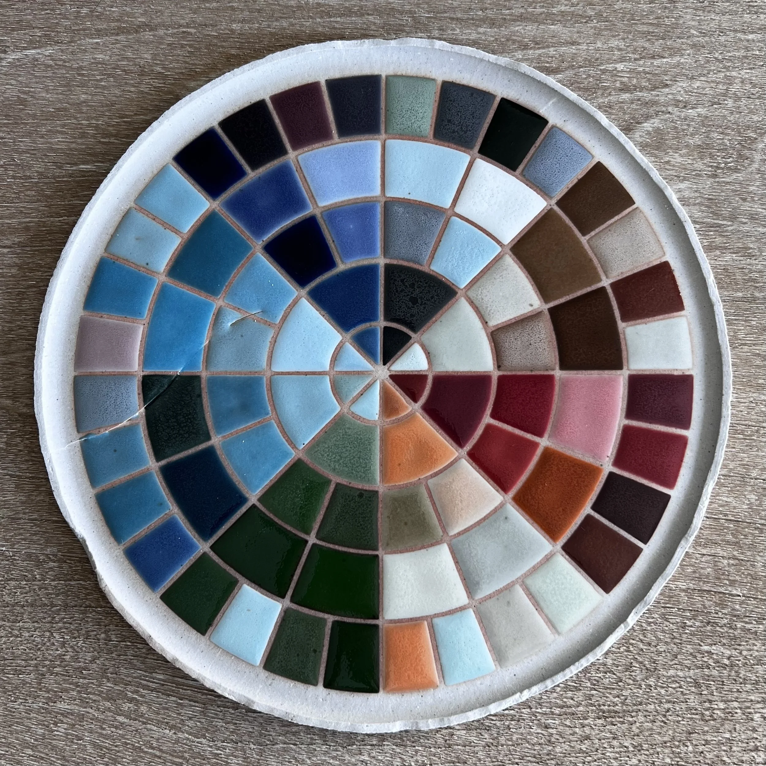
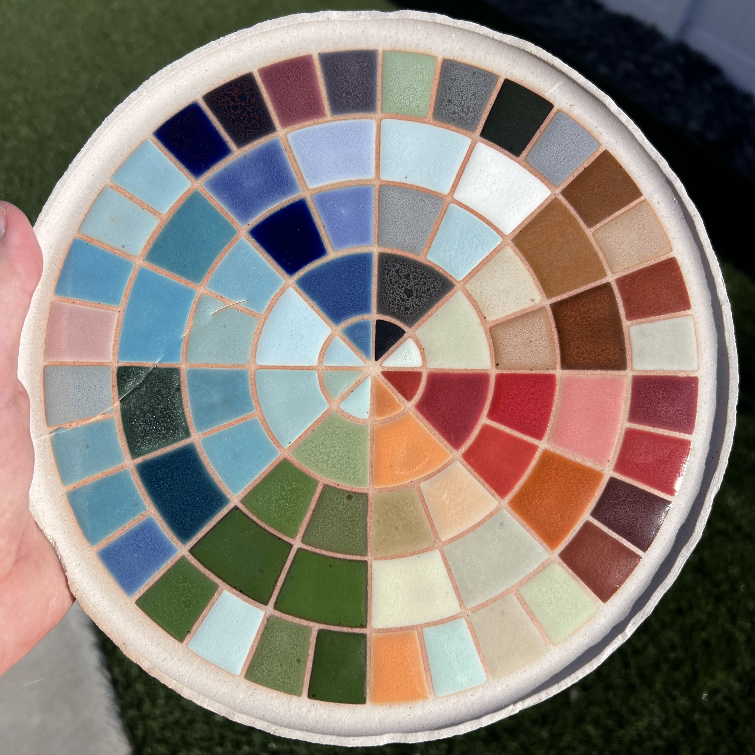
This is a 10-inch test plate with 48 individual Mayco Stroke & Coat colors and 32 custom mixtures, fired to cone 10 in a gas reduction kiln. Eighty glazes. One plate. (Special cameo by one crack.)
The inner four rings hold the 48 straight-from-the-bottle colors. The outer ring holds 32 mixtures I mixed to try and fill the gaps that cone 10 sometimes creates — because when half your yellows turn to tan and your purples vanish, you gotta get creative.
The Plan:
Here's the map I used to plan the whole plate. Eight wedge groups radiating clockwise from 12 o'clock: Blacks & Grays (W1), Warm Neutrals & Browns (W2), Reds (W3), Oranges & Yellows (W4), Greens (W5), Teals (W6), Light Blues (W7), and Dark Blues & Purples (W8).
The inner four rings (R1–R4) hold the 48 straight-from-the-bottle colors, running lightest near the center to darkest toward the outside. The outer ring (R5) holds all 32 custom mixtures — labeled M1 through M32.
One small note: I accidentally swapped M21 and M22 when glazing. M21 was supposed to be "Island Hopper" (Leapin' Lizard + Blue Isle) and M22 was "Mood Ring" (Purple Haze + The Blues) — they're in each other's spots on the fired plate. Everything else followed the plan.
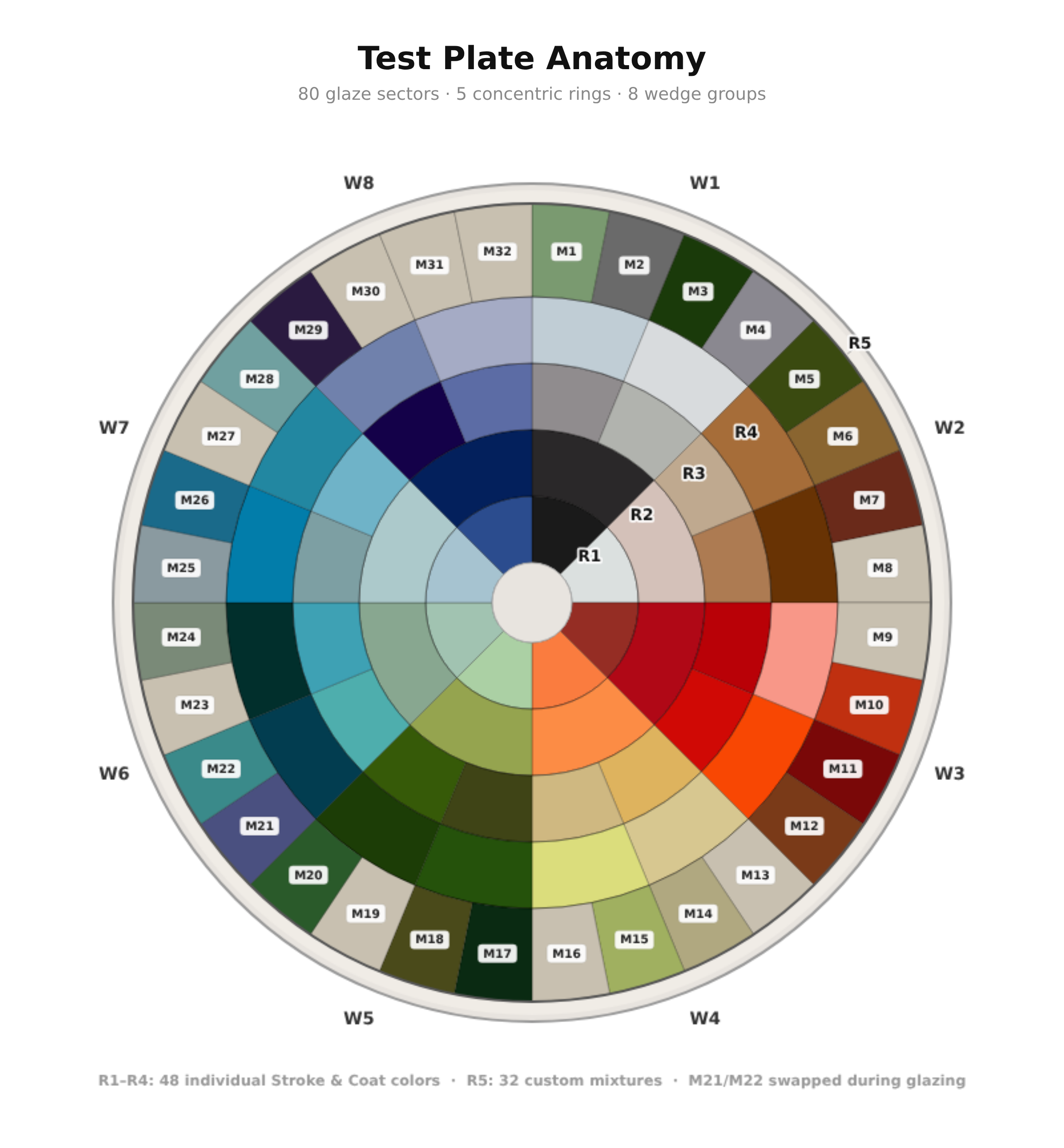
| Ring | Sectors | Layout | What's in it |
|---|---|---|---|
| R1 | 8 | 1 per wedge (full 45°) | 1st color in each group — darkest |
| R2 | 8 | 1 per wedge (full 45°) | 2nd color in each group |
| R3 | 16 | 2 per wedge (split 22.5°) | 3rd & 4th colors — slots a/b |
| R4 | 16 | 2 per wedge (split 22.5°) | 5th & 6th colors — slots a/b |
| R5 | 32 | 4 per wedge (split 11.25°) | Custom mixtures — the experiments |
Note: Hex values shown are the pre-fire Mayco Stroke & Coat colors. At cone 10, many shift — yellows go tan, purples fade, but iron-based colors (browns, reds, greens) and cobalt blues hold strong.
What Worked (and What Didn't)
Short answer: iron-based glazes are absolute tanks at cone 10. Every brown, every red that relies on iron oxide, every green in the earthy family — they came through. Cobalt blues were rock solid too, which wasn't a surprise since cobalt is one of the most stable high-fire colorants out there.
The greens are stunning. The whole bottom-left arc of the plate — from deep forest to bright spring green — shows just how much range you can get from iron and copper at this temperature. This is the palette I build designs around.
The blues held character across the board. Dark navy, medium blue, light sky — all stable, all usable. If you're working at cone 10 and want reliability, blue is your best friend.
Reds and oranges? Better than expected. Candy Apple Red, Hot Tamale, Jack O'Lantern — they all kept their identity. The iron in these formulas gives them backbone at high fire.
And then there are the yellows. If you read the Yellows post, you already know — most of them shift toward tan or gold. That's not a failure, it's just what happens when you push these glazes past their comfort zone. But it does mean the palette has gaps. Which brings us to the fun part.
The Mixtures
The outer ring is where I got nerdy. I designed 32 custom mixtures — each one a blend of two Stroke & Coat colors in a specific ratio — to answer one question: can I create the colors that cone 10 takes away?
Here's how I approached it. Each wedge group got four mixture slots. I wanted to test combinations that filled specific gaps: a deeper red, a true purple, a chartreuse, a richer blue. Every mixture got a nickname (because what's the point of being a potter if you can't name your colors?) and a specific recipe.
| Slot | Nickname | Recipe | Ratio | Verdict |
|---|---|---|---|---|
| M3 | Swamp Thing | Tuxedo + Just Froggy | 20/80 | Excellent |
| M5 | Bean There | Java Bean + Green Thumb | 50/50 | Excellent |
| M7 | Snickerdoodle | Crackerjack Brown + Cinnamon Stix | 50/50 | Excellent |
| M10 | Ring of Fire | Hot Tamale + Jack O'Lantern | 50/50 | Excellent |
| M11 | Black Cherry | Candy Apple Red + Tuxedo | 90/10 | Excellent |
| M12 | Spice Route | Cinnamon Stix + Java Bean | 50/50 | Excellent |
| M17 | Lucky Streak | Irish Luck + Teal Next Time | 50/50 | Excellent |
| M18 | Camo Mode | Army Surplus + Sour Apple | 50/50 | Excellent |
| M20 | Leap Year | Just Froggy + Leapin' Lizard | 50/50 | Excellent |
| M26 | Deep End | Blue Yonder + Spruce It Up | 75/25 | Excellent |
| M6 | Mud Pie | Brown Cow + Café Olé | 75/25 | Excellent |
| M29 | Plot Twist ★ | Moody Blue + Ruby Slippers | 75/25 | Promising |
| M15 | Lemon Drop | Sunkissed + Lime Light | 50/50 | Promising |
| M1 | Sage Advice | Green Thumb + Cotton Tail | 50/50 | Promising |
| M24 | Silver Sage | It's Sage + Gray Hare | 50/50 | Promising |
| M28 | Sea Glass | Spruce It Up + Lime Light | 50/50 | Promising |
| M25 | Blue Monday | My Blue Heaven + Melon-choly | 50/50 | Faded |
| M14 | Honey Trap | Dandelion + Poo Bear | 50/50 | Faded |
| M2 | Charmed Life | Char-ming + Lavendear | 50/50 | Faded |
| M4 | Hare Apparent | Gray Hare + Lavendear | 50/50 | Faded |
| M21 | Mood Ring * | Purple Haze + The Blues * Swapped with M22 during glazing |
50/50 | Promising |
| M22 | Island Hopper * | Leapin' Lizard + Blue Isle * Swapped with M21 during glazing |
50/50 | Excellent |
Verdict key: Excellent = clearly successful, usable in designs today Promising = needs in-person verification under controlled lighting Faded = pigment didn't survive cone 10 as hoped
Here are the ones that were standouts to me:
Swamp Thing (Tuxedo + Just Froggy, 20/80) — A deep shadowed forest green with inky depth. This is the kind of green you can't buy in a bottle. It looks like it belongs in a mossy old-growth forest and I'm obsessed with it.
Snickerdoodle (Crackerjack Brown + Cinnamon Stix, 50/50) — A deep red-brown oxblood that has no business being this striking. One of the best surprises on the plate.
Ring of Fire (Hot Tamale + Jack O'Lantern, 50/50) — A red-orange bridge color that held its vibrancy. Fills the exact gap between my reds and oranges.
Black Cherry (Candy Apple Red + Tuxedo, 90/10) — Deeper, more serious red. Like Candy Apple grew up and got a leather jacket.
Lucky Streak (Irish Luck + Teal Next Time, 50/50) — Richly saturated dark green that sits in a completely different spot than any individual green in the line.
Deep End (Blue Yonder + Spruce It Up, 75/25) — A rich medium blue that fills the gap between the light and dark blues. Exactly what I needed.
The Purple Problem
Purple is the hardest color at cone 10, and that makes me sad. The pigments that create purple in low-fire glazes — manganese, certain cobalt-chrome combinations — just don't survive 2,300°F the way iron and cobalt do.
My best candidate is a mixture I'm calling Plot Twist (Moody Blue + Ruby Slippers, 75/25). In the photos, it reads dark with what might be a violet or plum undertone. But "might be" is doing a lot of heavy lifting in that sentence. I need to examine this one in person under controlled lighting before I call it a true purple.
The lighter-path purple attempts — mixing things like Lavendear or Grape Jelly into other bases — didn't make it. They shifted to gray or brown, which is exactly what I’ve seen before.
Purple at cone 10 is going to get its own blog post eventually. It deserves one. Gonna try the same approach that I did with yellows, and try mixing in some underglazes to see if it brings the purple through. I’ve tried it before and got some horrible bubbling, so I’ll tread with caution.
What’s Next?
This plate isn't just a test — it's a reference tool. Every time I sit down to plan a new design, I can hold this plate next to my stencil and see exactly what each color and mixture will look like at cone 10. It’ll make me feel like a true artiste.
And… to be honest after the car crash, I’m thinking about trying these colorful designs on a smaller scale… potentially magnets? We’ll see how that goes.
More soon.
— Will